Ascending with
Precision.
Engineering
Vs. Perception
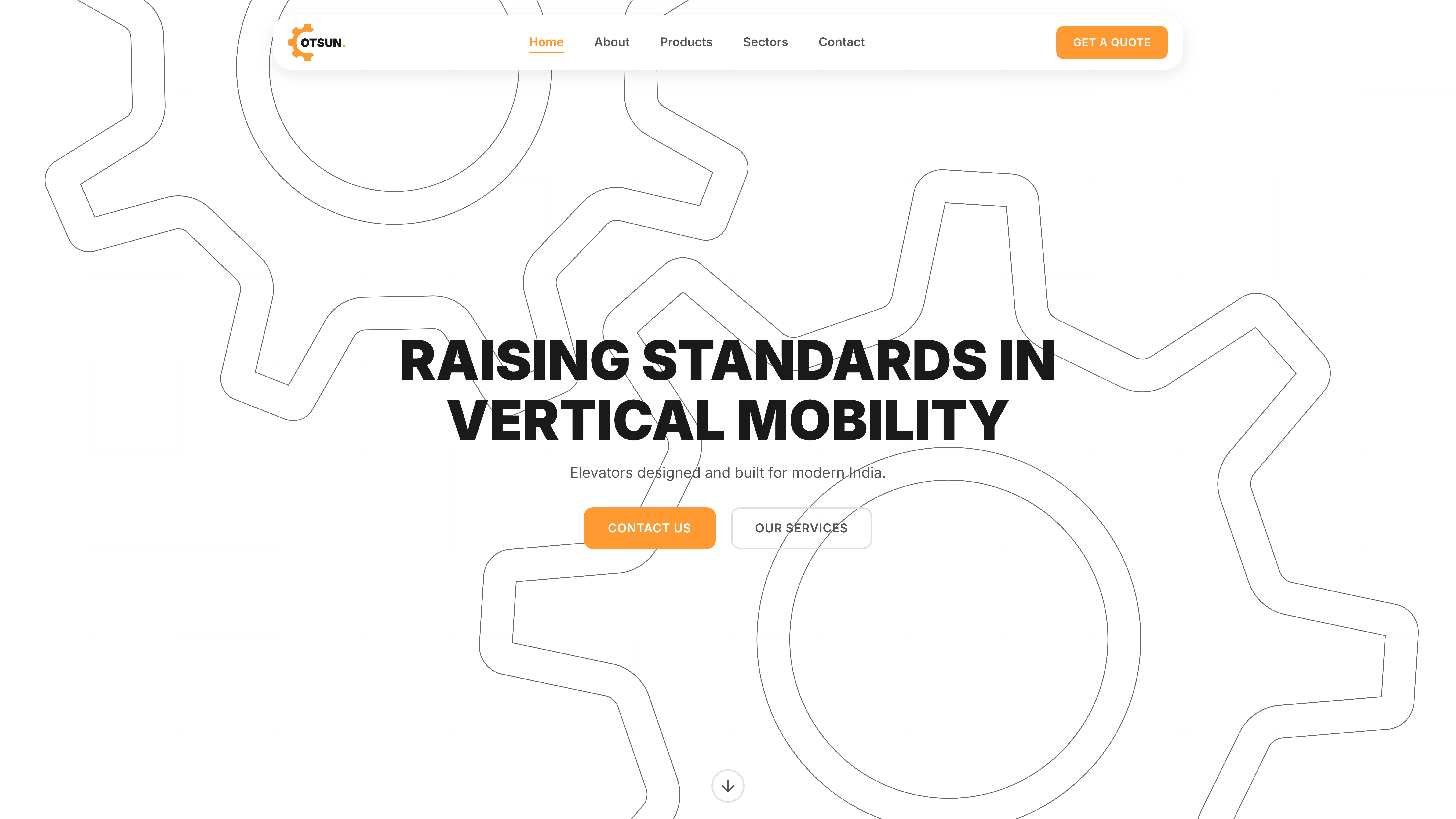
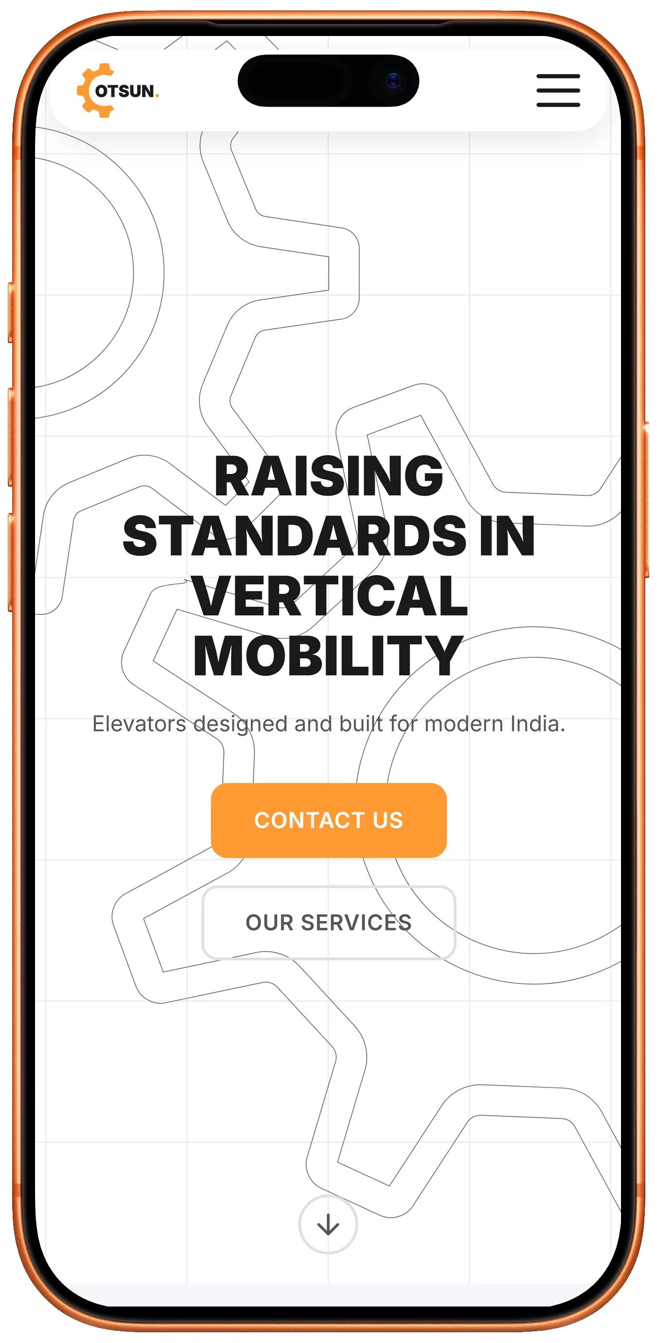
Otsun creates world-class vertical transportation systems, but its legacy brand identity no longer reflected the quality of its engineering. In a market dominated by global competitors, Otsun's digital presence felt dated and overly industrial, underrepresenting its safety standards and premium capabilities.
The brand needed a visual language for B2B architects and developers: clean, precise, technically credible, and clearly premium.

A System Built
on Safety
We refined the brand around its core attributes: strength, motion, and reliability. We developed a minimalist logo system reflecting verticality and established a professional color palette.
The new website functions as a digital showroom, using high-fidelity imagery and micro-interactions to help developers inspect product quality virtually.
Elevating the Brand
"Super creative, easy to work with, and they really understood what we needed. The results turned out way better than we expected."