
NILO / Product UI & website
A small link.
A whole workspace.
We designed the app people return to and the website that brings them there. One place to publish a page, make an introduction, take bookings and see what people do next.
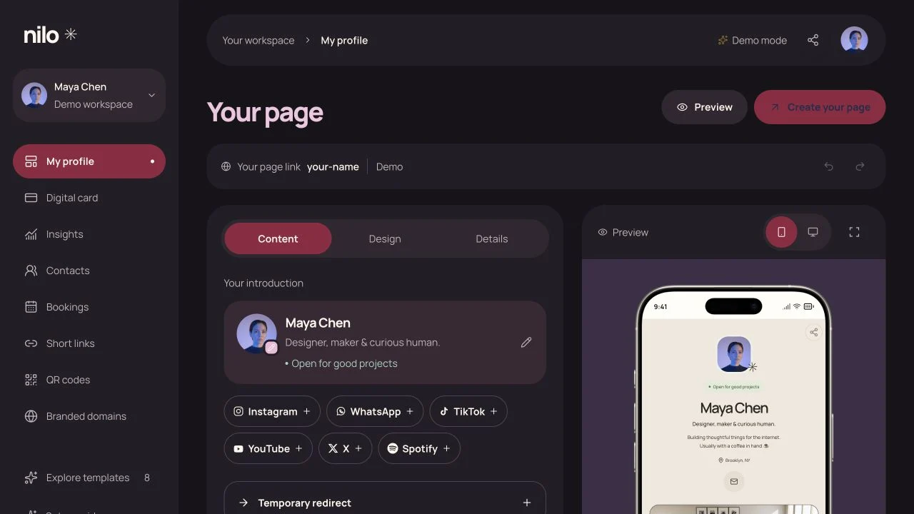
01 / Workspace
Keep the work in view.
A link in a bio can be a portfolio, a contact card or the start of a booking. The challenge was to fit those jobs into one app without making a first page feel like a large project.
We gave the workspace a clear centre: your page. Content, Design and Details sit beside a live preview. Bookings, contacts, short links and QR codes have their own places in the navigation. You can make one edit without losing sight of the whole page.
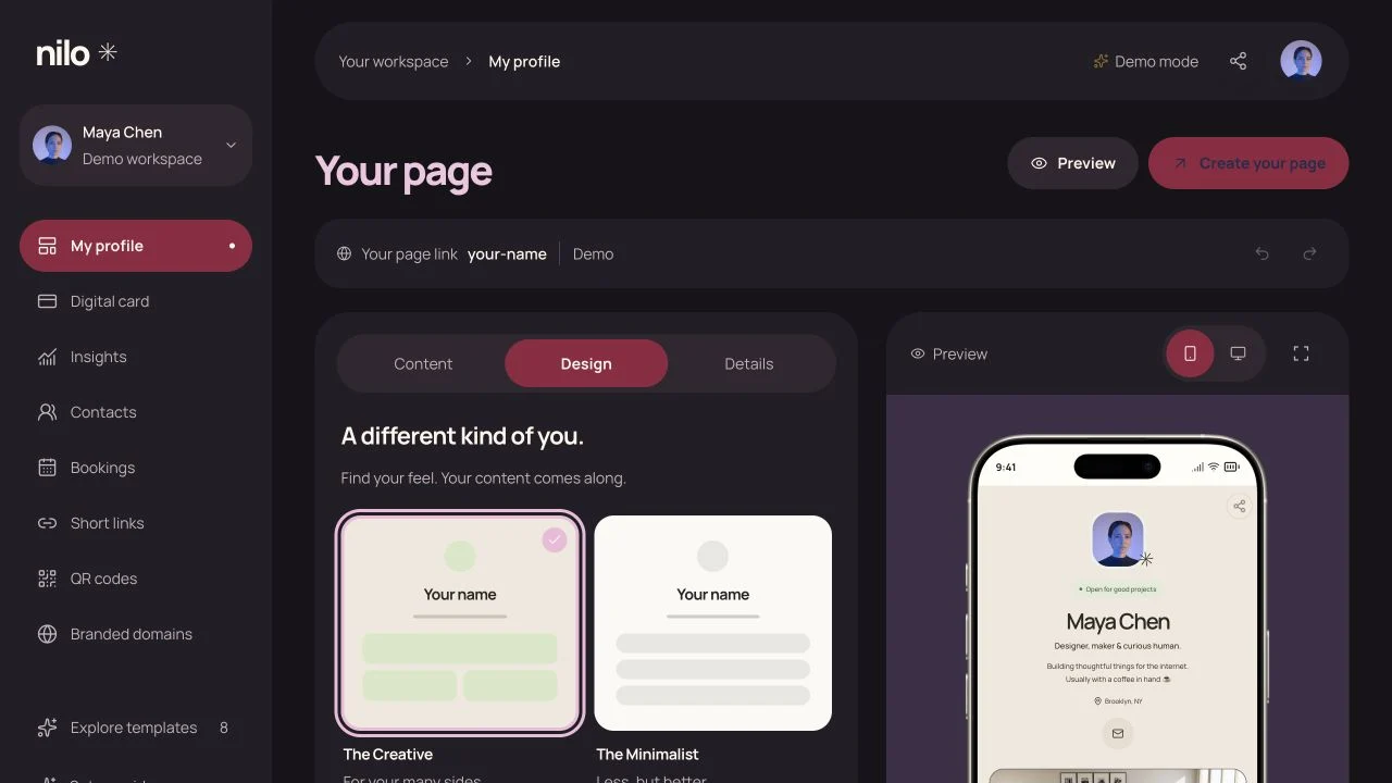
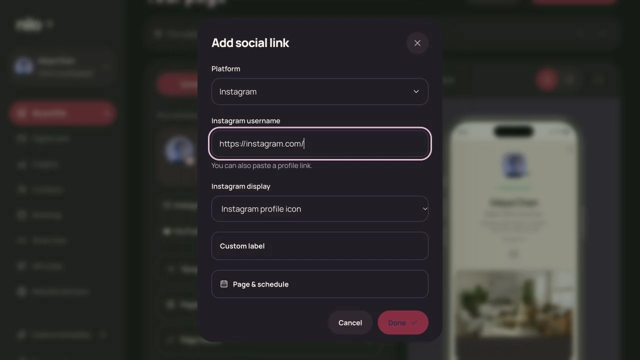
From first edit to first share
- Set upChoose a name and give the page a starting shape.
- Make it yoursAdd content and see how it looks as you work.
- PublishChoose when the draft becomes the page people see.
- ShareSend the link or hand someone a digital card.
02 / Identity
One identity.
Many ways to meet.
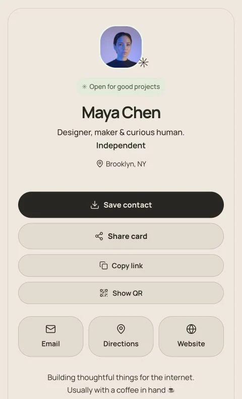
The public page gives the full picture. The digital card is for the moment someone wants to save a contact, send a message or keep a link. It carries the page’s colours and type, so it feels like the same person made both.
That distinction guided the visual system. Maroon marks the app’s primary actions. Warm paper and charcoal keep the editing surfaces quiet. The creator’s chosen style stays visible in the preview and belongs to the things they share.
- Maroon
- Pink
- Paper
- Charcoal
03 / Insights
What happened after the link?
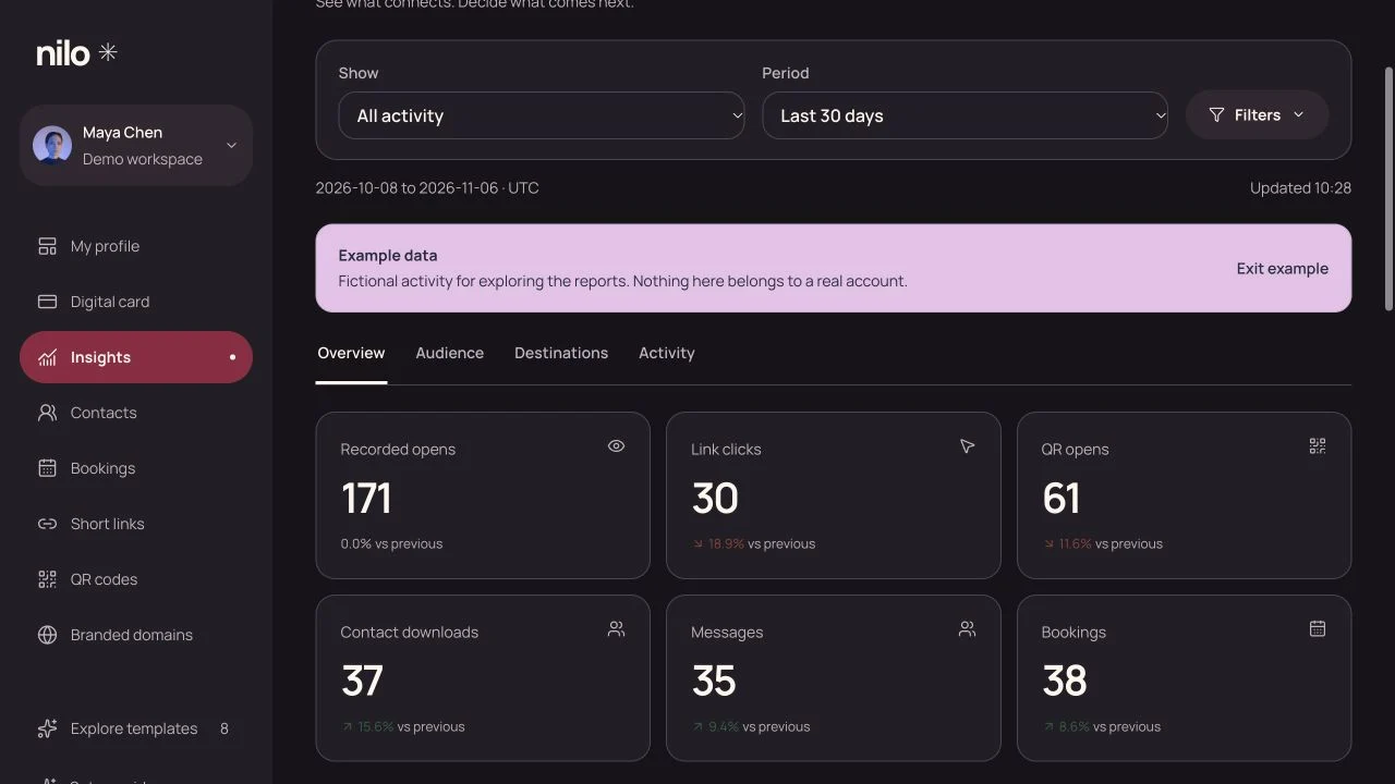
An open, a click and a saved contact tell different stories. Insights gives each its own place, with filters for a page, card, short link or QR code and a comparison to the previous period.
The overview answers what changed. The audience, destination and activity views let people look closer when they have a specific question.
04 / Website
Let the product make the introduction.
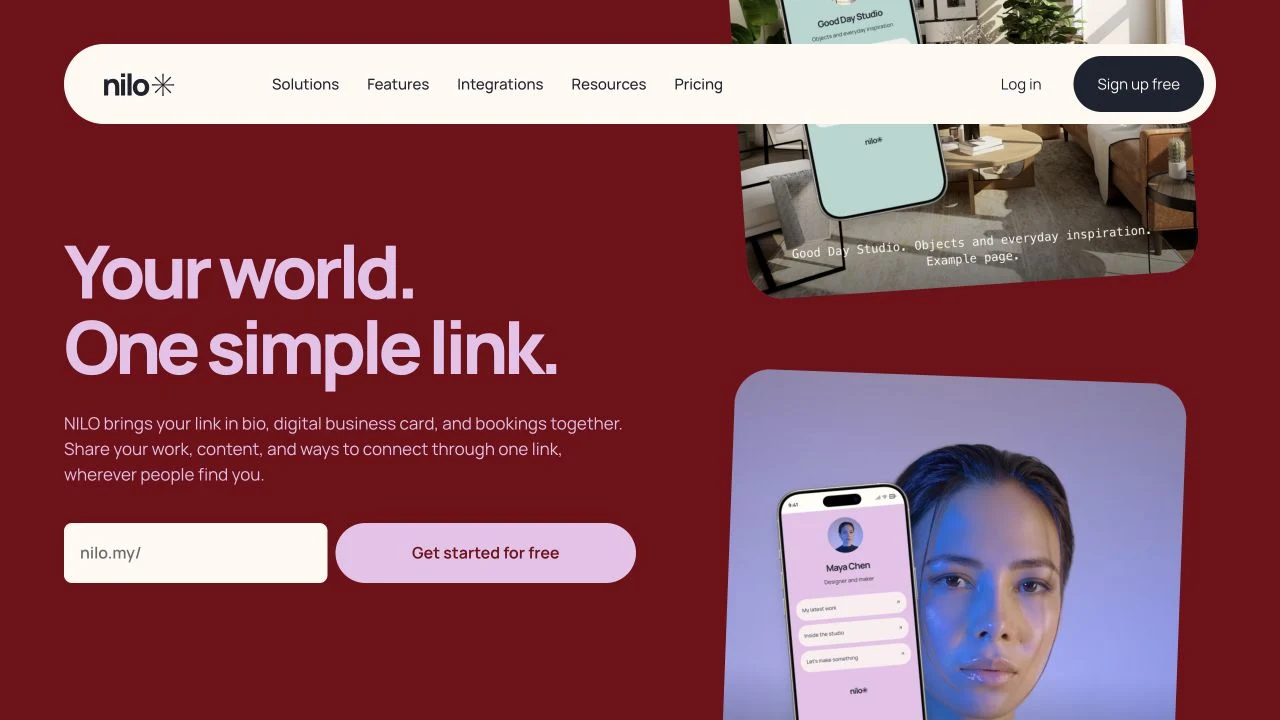
Actual page examples do more than a list of features can. The homepage puts them beside a place to try a username, so visitors can picture both what they’ll make and where it will live.
Feature pages, templates, help and account screens continue the same story. The website has room for expressive colour and movement. The workspace carries the brand in smaller doses, where it can guide the next action.
In use
Designed to be lived in.
NILO is live. The same design system runs from the first visit to the editor, public profiles, digital cards and the tools people use to share and manage them.
Let’s Talk.
Tell us what your brand, website, or product needs to do.
Discuss a project ↗